Happy 2012! As you may have noticed, I’ve made a New Year’s resolution! Or maybe you haven’t noticed because I haven’t been posting as frequently as I should have.
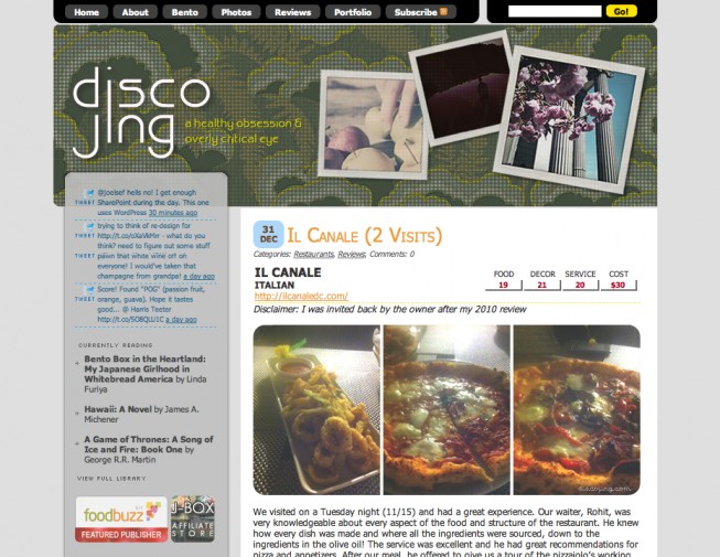
Well, my resolution for this year was to be less lazy/more motivated, and that includes updating my blog more often! I hadn’t changed the layout for a few years, sometimes just changing the header. Not only was it hard to find the time to update my site, but I was also lacking inspiration! Web Design used to be a hobby, but now it’s my profession. As such, sometimes I feel that all my creative juices get sucked out 9-5 and when I get home the *last* thing I want to do is design something or type on the computer.
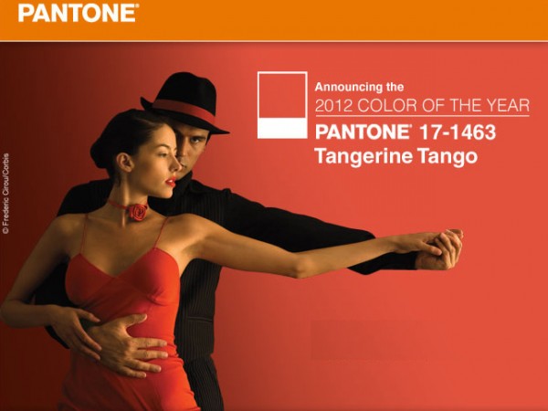
For Christmas my Grandma gave me a cookbook I have been lusting after since it was first published: Baked Explorations: Classic American Desserts Reinvented. Not only did I get inspired by the stunning photos and typography, but I was also aligned with the book’s philosophy. With a new color scheme (including Pantone’s Color of the Year for 2010) and a new outlook, I played with the design for a few days and then spent a day implementing it.
So, here’s to out with the old and in with the new!
More detailed specifics on the new layout will be found soon under the About section. Please feel free to share your thoughts, or let me know if something is broken or doesn’t look right!





Bakes is a gorgeous book! You are surely going to enjoy it.
I absolutely adore the photography! I’m bummed there aren’t pictures for every recipe though. I’m bad at using my imagination when it comes to food recipes, so if I ever made a cookbook, you better believe there’s a picture for every recipe!
Thanks for sharing your site inspiration. How fun.
I also think cookbooks should have a beautiful photo for every recipe. I don’t think it’s too much to ask! 🙂